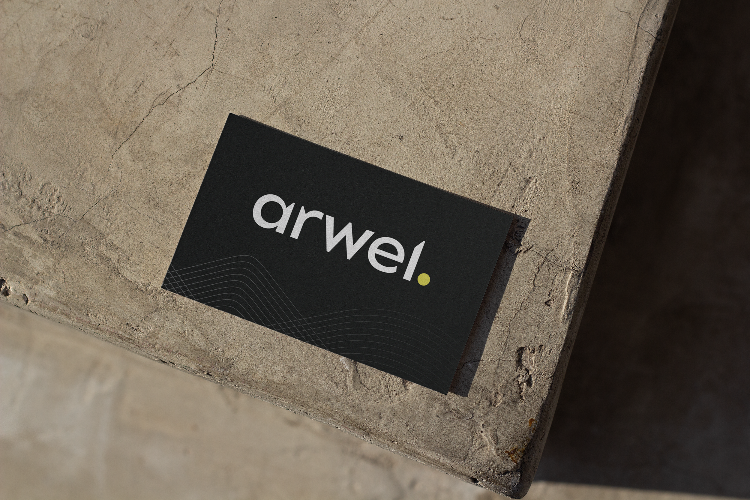
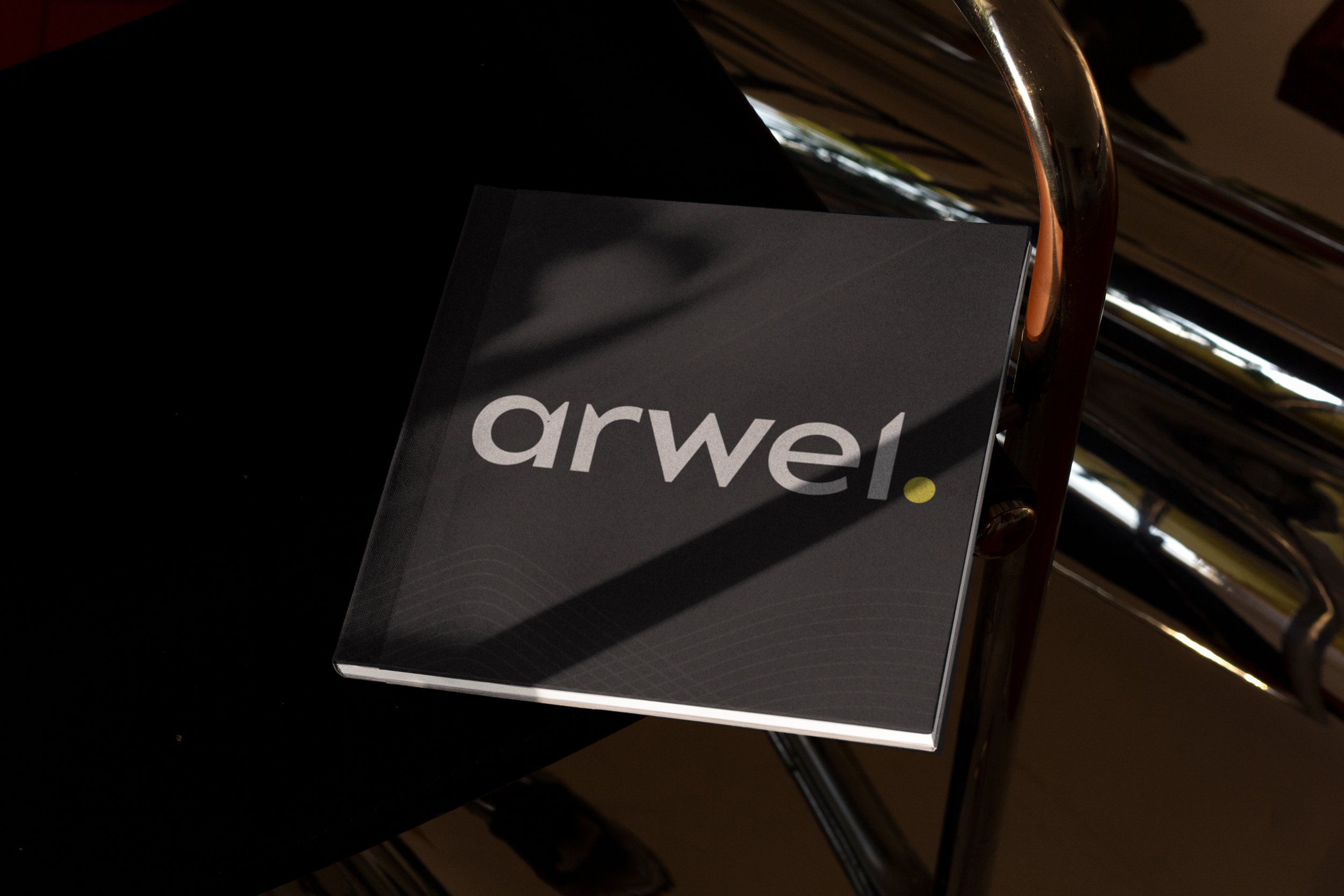
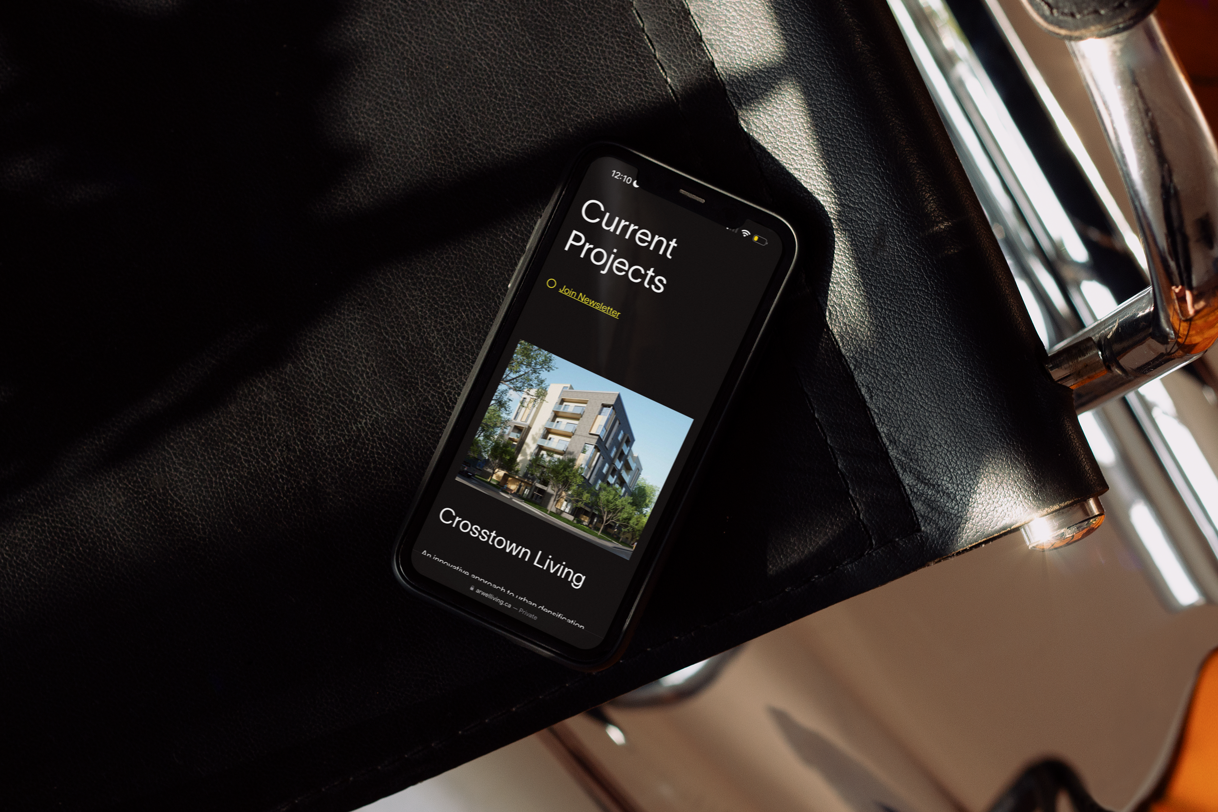
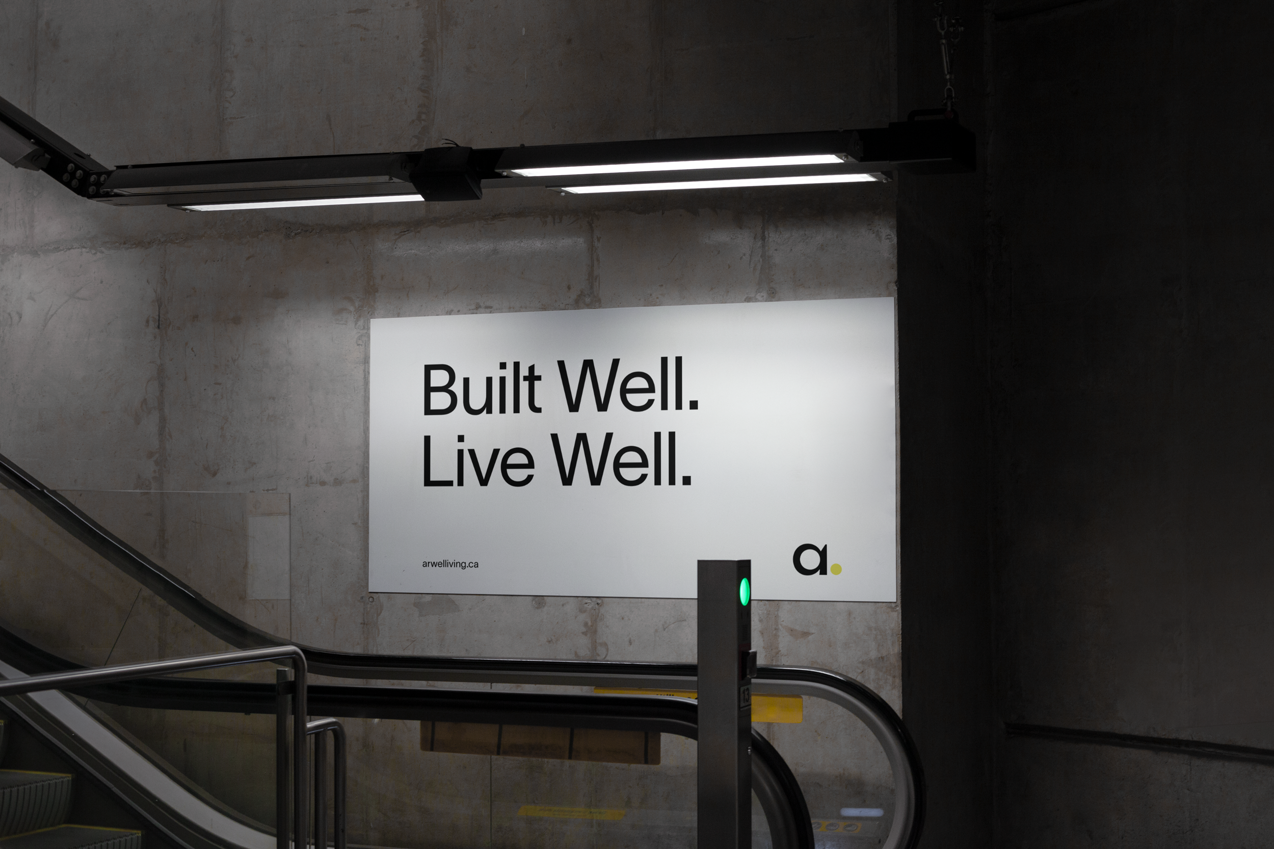
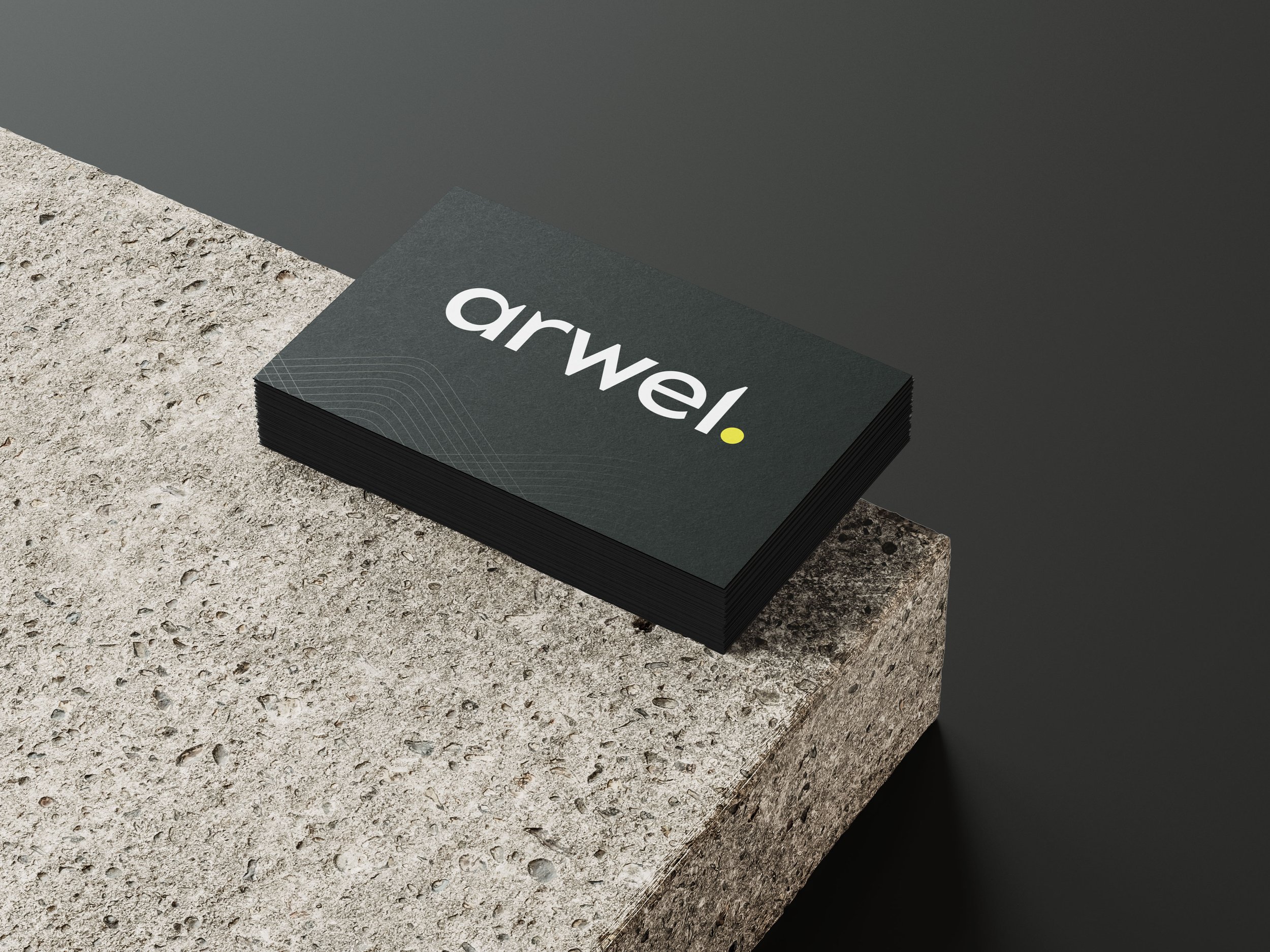
Arwel transforming spaces for thriving lifestyles. They re-defining a living space. This brand has a monochrome colour palette with a pop of yellow. To be a leader in the building industry with multiple target markets, black appeals to a mass audience and strikes neutrality and balance. Yellow is energetic and youthful – bringing in optimism. Paired together, these colours demonstrate timeless style and grab attention.
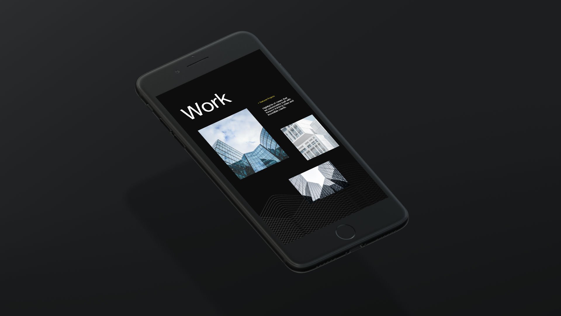
Using repetition in the graphic elements represents the growth of these flourishing communities. Powerful and concise, the brand aesthetic remains bold yet approachable. It’s clean and straightforward with no fluff – mirroring the brand’s voice and tone.
Lead Designer at NatPark Creative Agency