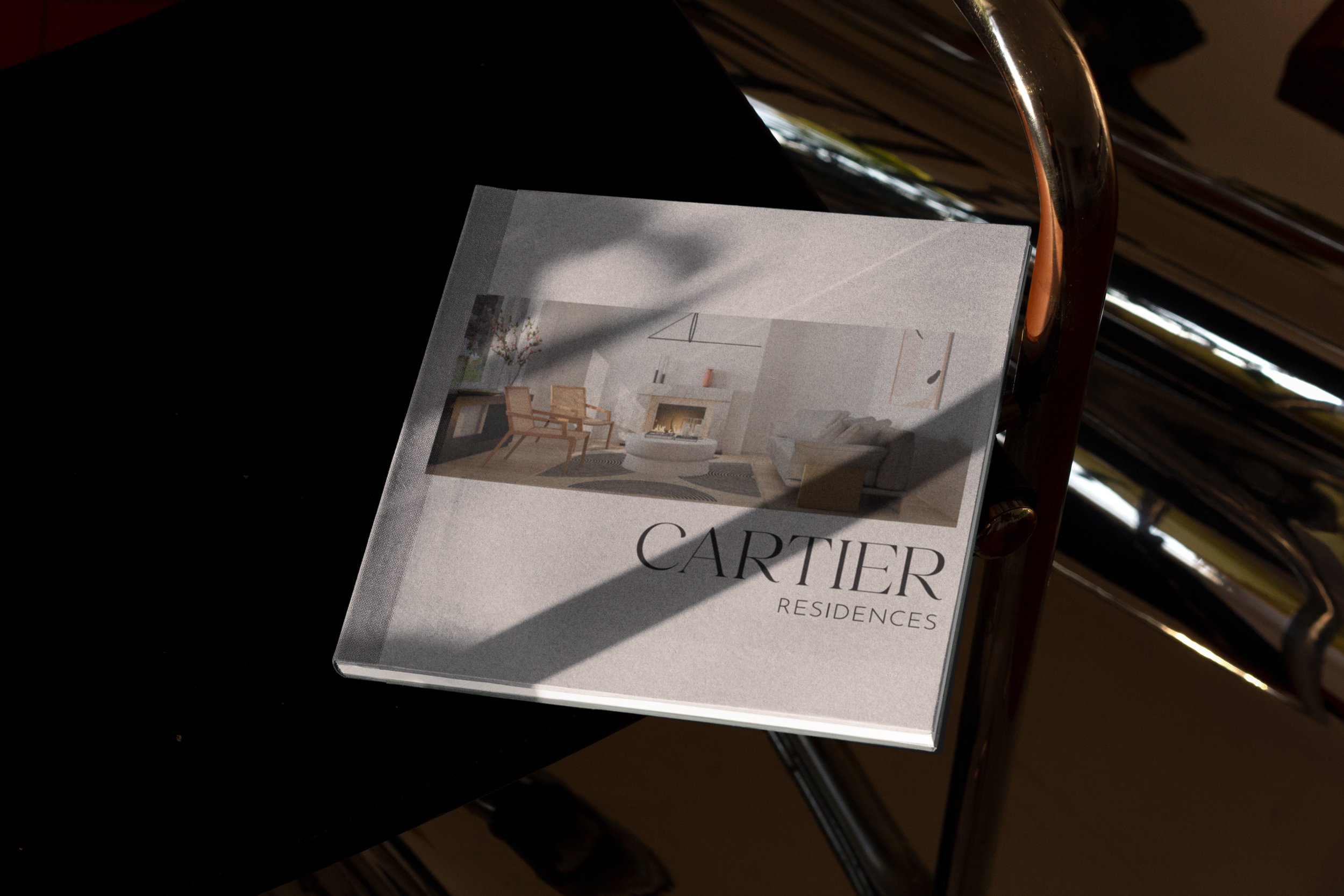
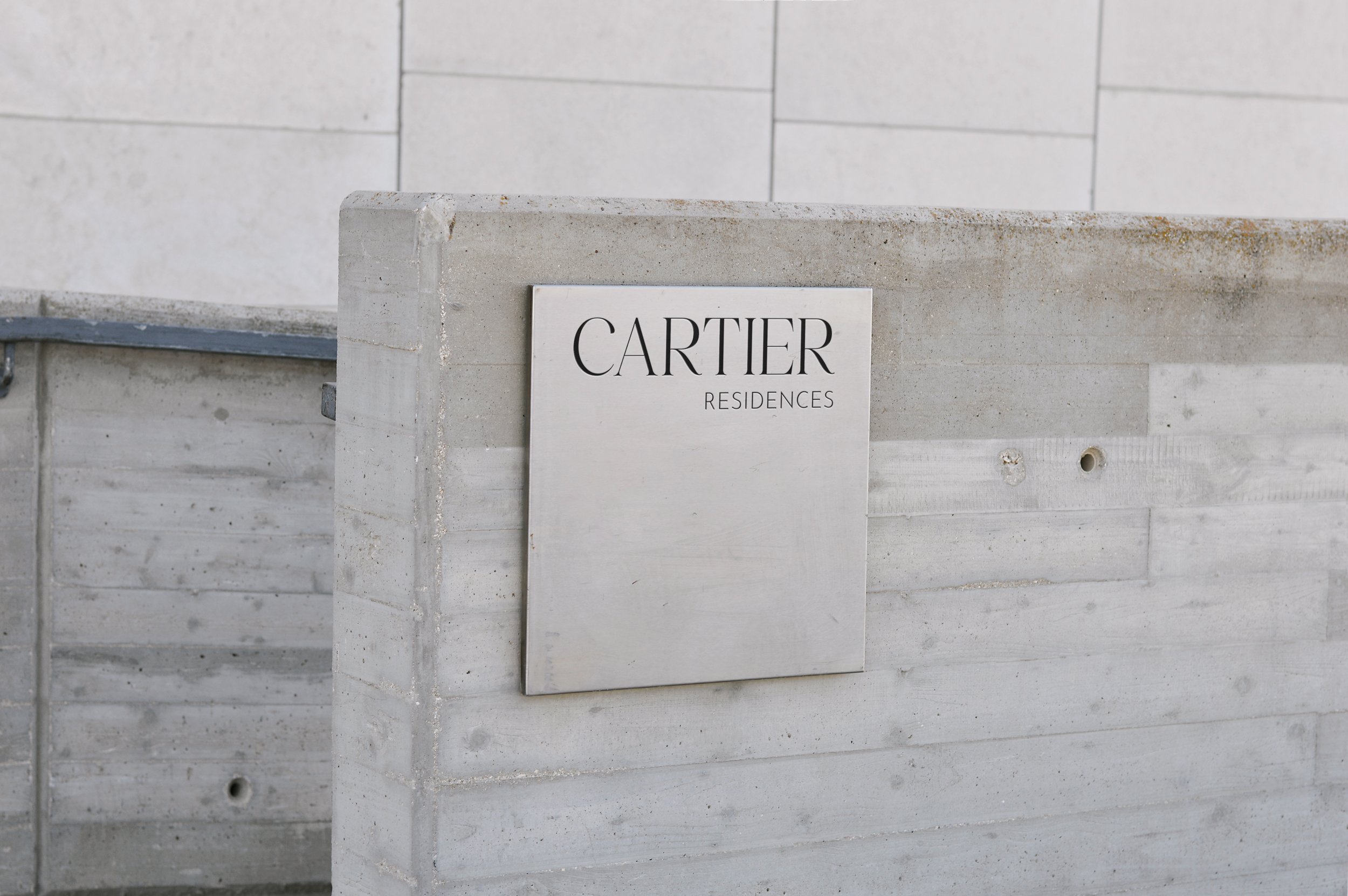
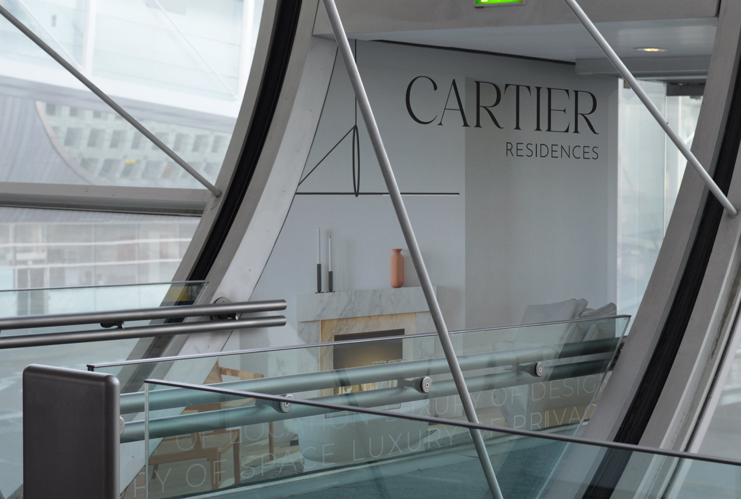
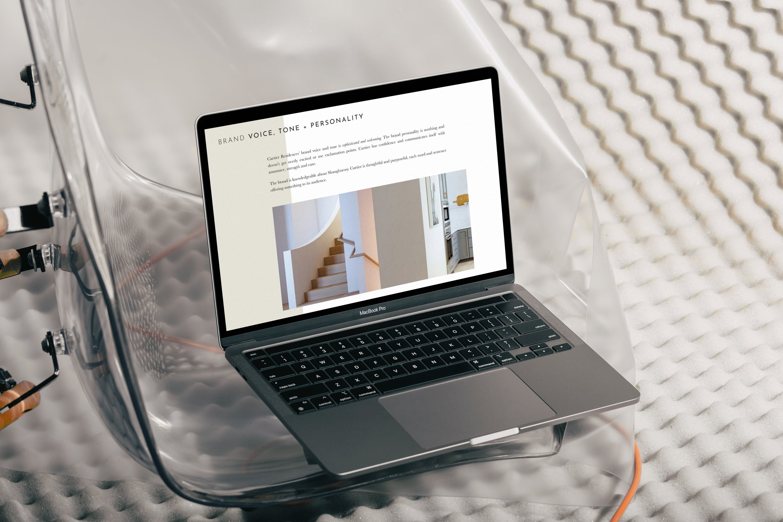
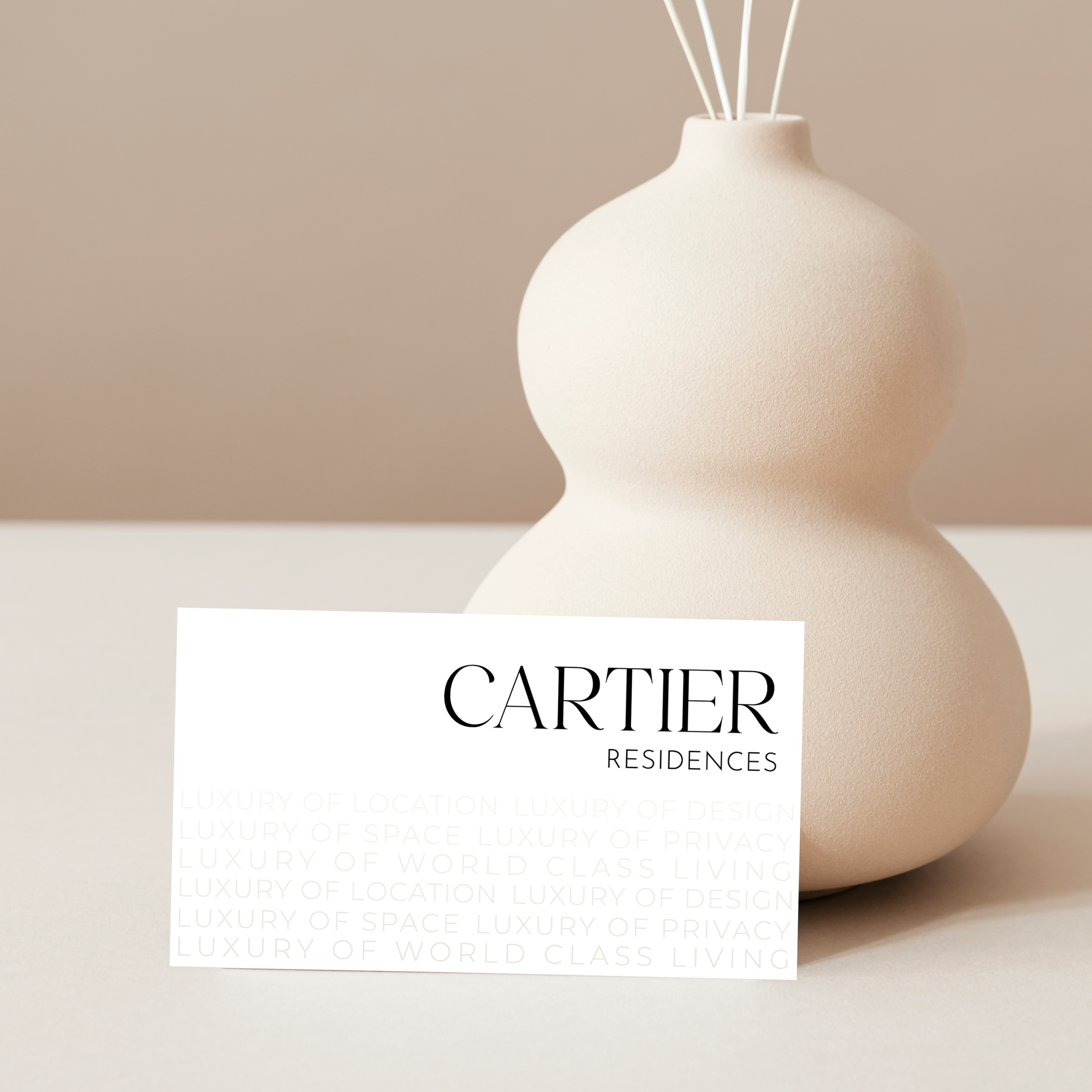
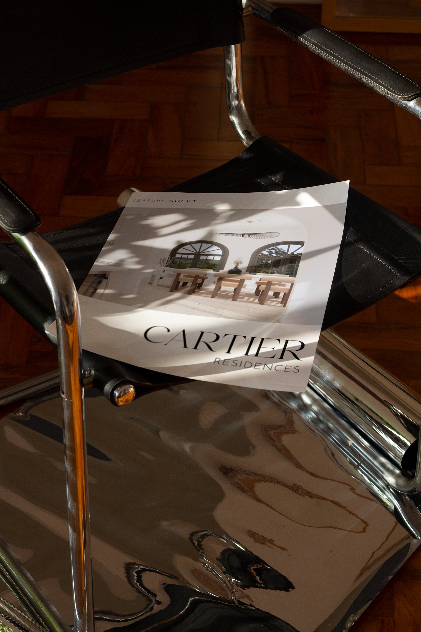
Cartier Residences’ brand identity has a high-end editorial style, with intentional large-scale imagery balanced with minimalist text letting the quality design of these homes speak for themselves. Eye-catching and elegant serif typography is used to capture both the modern, yet traditional style of the exterior and interiors in this highly sought-after and historic neighbourhood for the homeowner who desires a modern lifestyle.
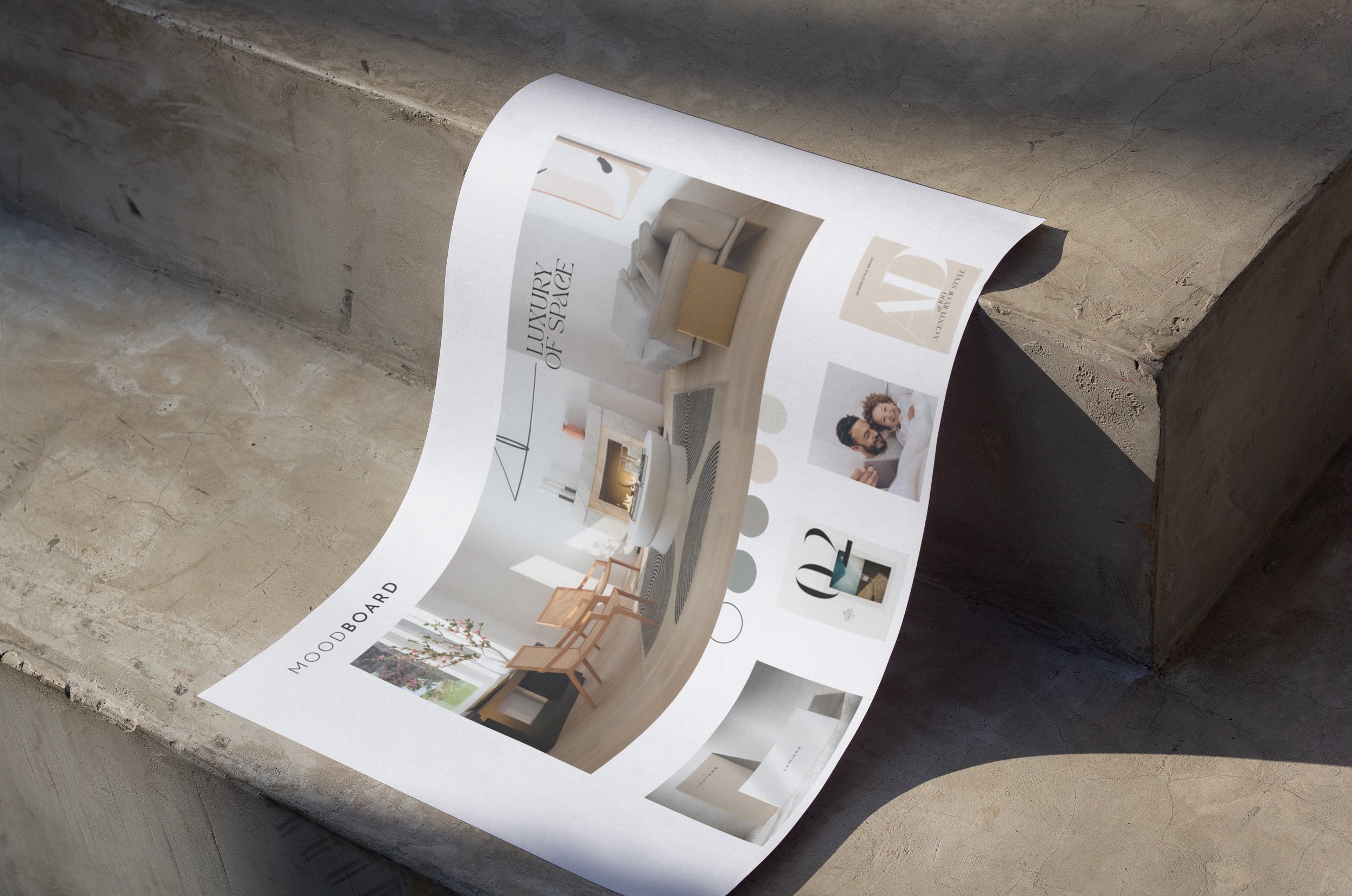
This brand uses “luxury” as its hard-hitting word. The target market will get an instant sense of how the Cartier Residences will elevate their quality of life and meet their needs. Cartier Residences draws inspiration from the interior design colours as its colour palette, maintaining a light, cool earthy tone that creates an airy and modern feel. Ample white space allows for the target market to pause and reflect while engaging with this branding. Perfectly balancing modern and traditional design styles, this brand is elegant and refined. It’s inviting while maintaining its air of class and sophistication.
Lead Designer at NatPark Creative Agency