Journey Into Breath
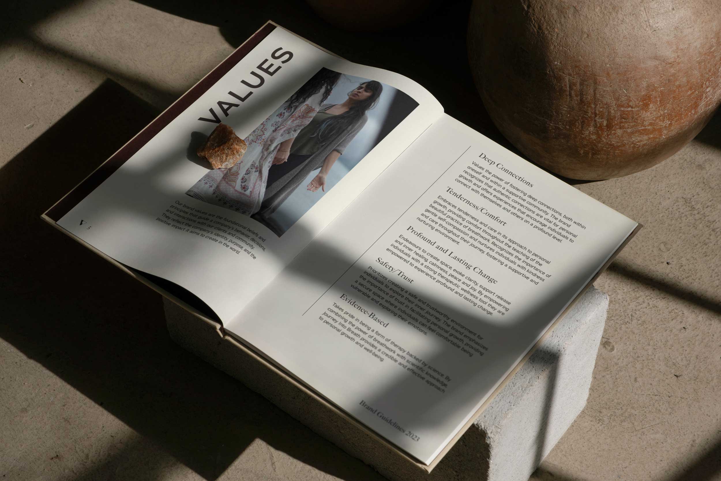
The brand essence of Journey Into Breath blends spirituality and science, capturing the transformative power of breathwork and its therapeutic benefits. This concept of duality highlights the interplay between dark and light tones, symbolizing the profound inner journey and balance achieved through breathwork.
Embracing both light and shadow, the brand acknowledges the spectrum of emotions within individuals. The darker elements evoke mystery, encouraging exploration of the subconscious and the confrontation of fears. The visual identity emphasizes balance, reflecting the importance of equilibrium in breathwork practices.
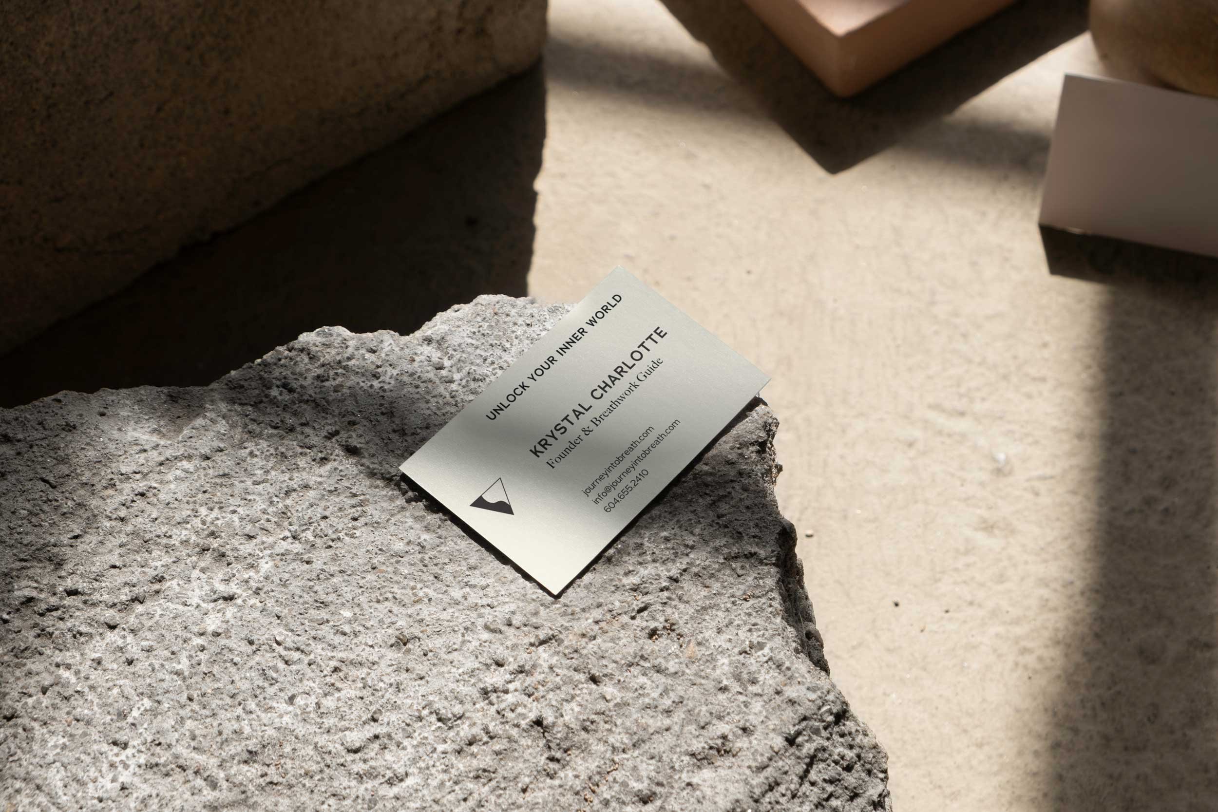
The color palette combines shades of black, brown, light brown, and cream, with midnight black evoking depth and deep browns providing grounding. Light brown and cream add warmth, representing the tranquility of breathwork.
Elevated typography conveys timeless elegance, featuring clean lines and subtle curves that resonate with a diverse audience. This creative direction aims for a lasting visual identity, ensuring Journey Into Breath remains relevant and resonant for years to come.
Lead Designer at NatPark Creative Agency


