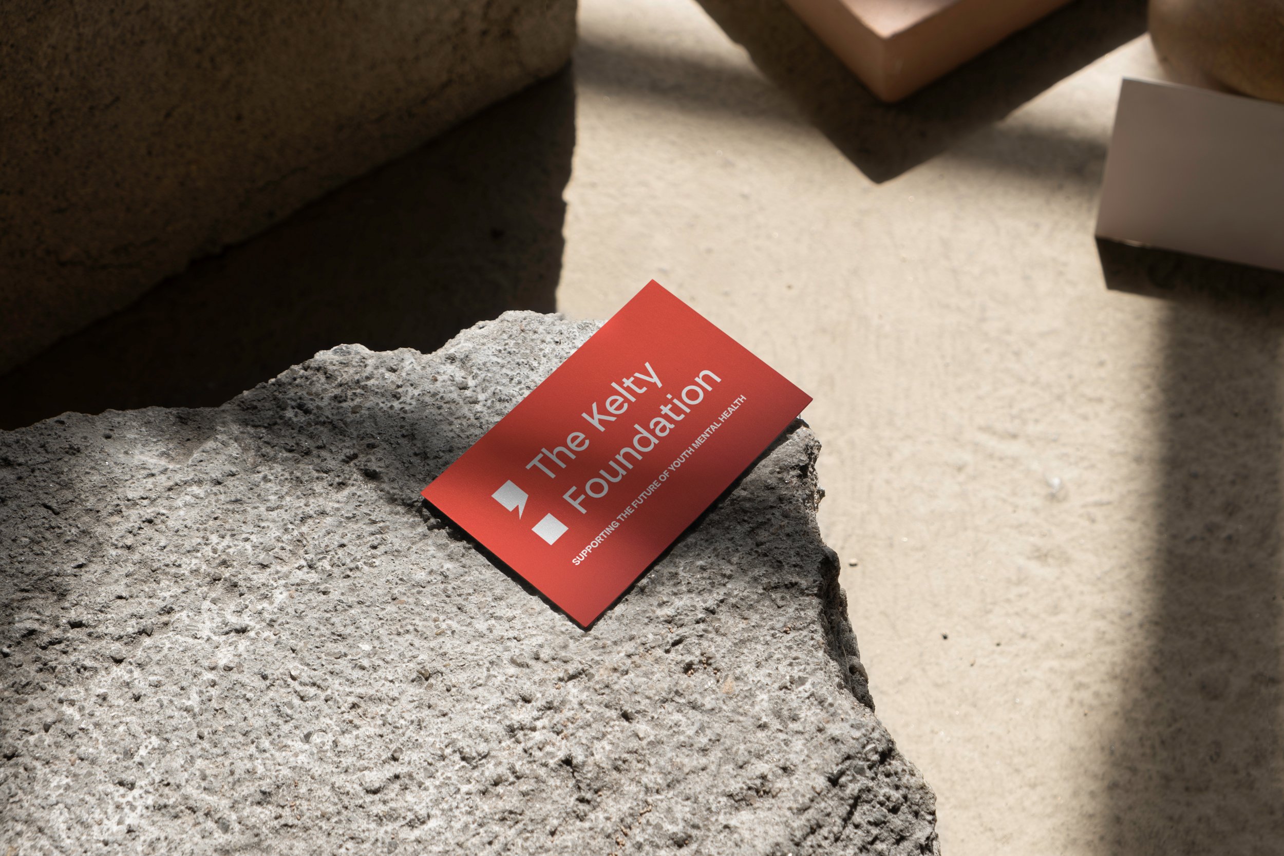
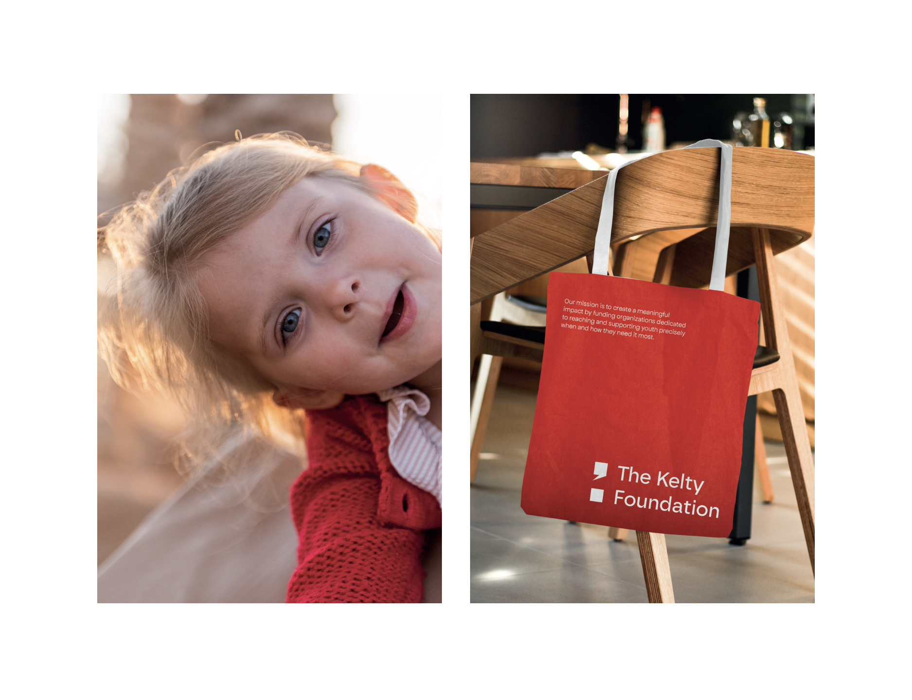
The semicolon, at the core of this rebrand for The Kelty Foundation, embodies profound symbolism and serves as a bold and modern representation of the organization's mission. Symbolizing the choice to keep moving forward; it represents a continuation rather than an ending, a true reflection of the organization's commitment to breaking the stigma surrounding youth mental health, providing unfettered access to support, and embodying persistence towards action. This modernized interpretation ensures that the symbol remains recognizable, forging a connection based on trust. It already carries global recognition as a powerful symbol for mental health, signifying resilience, progress, and the ongoing journey towards access for youth mental health. With its sleek, elevated design, starting at the base and curving upwards, it instills a sense of upward momentum, mirroring the positive outlook and progress that individuals can achieve with the organization's unwavering support and work.
The chosen red colour scheme, transitioning from a darker shade to a vibrant red gradient, encapsulates the essence of passion, action, access, and impact. The deeper red at the base pays homage to the organization's established identity, retaining the familiarity that existing clients and supporters have come to trust. This darker hue serves as a reassuring anchor, a reminder of the organization's legacy of commitment and reliability.
As the gradient progresses toward a more vibrant red, it mirrors the dynamic progression and positive impact the organization achieves. This shift towards a brighter red signifies the increasing energy and momentum that comes with taking action and making a real difference in youth mental health.
Red, as a colour, inherently conveys a sense of urgency and determination, aligning perfectly with the organization's mission to provide accessible support and create lasting impact. It's a colour that grabs attention, evokes strong emotions, and inspires action, making it an ideal choice to reinforce the values of passion, access, and impact within the rebrand.
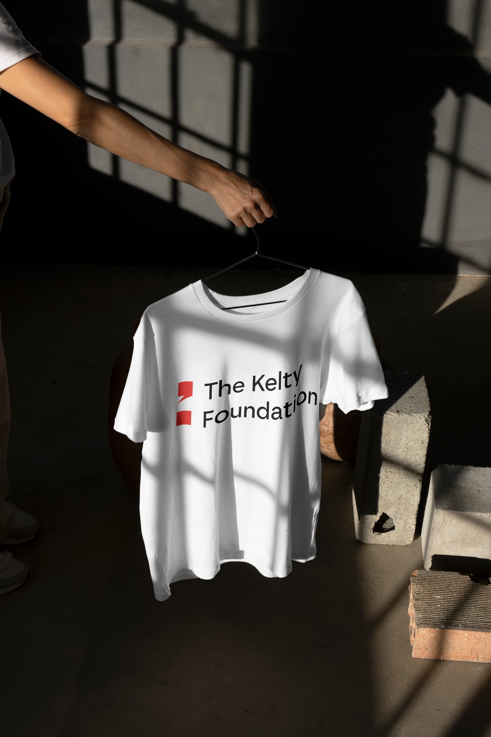
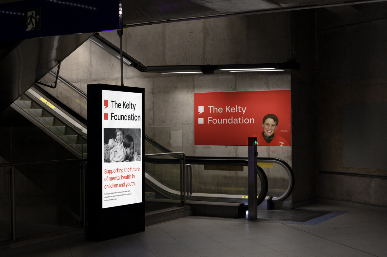
Black, white, and grey serve as a sophisticated and balanced contrast to the vibrant red in this rebrand, providing a clean and versatile backdrop that enhances the overall aesthetic while allowing the red to convey passion and urgency effectively. This colour scheme, combined with strategic utilization of negative white space, adheres to modern design principles, fostering ease of navigation and a sense of clarity, which is crucial in conveying the organization's message of accessibility and support in a visually appealing and user-friendly manner.
The choice of sans-serif typography embodies a modern, bold approach that aligns seamlessly with contemporary design principles. Sans-serif fonts are inherently clean, minimalistic, and devoid of decorative elements, ensuring clarity and legibility, which is paramount for a user-friendly and accessible brand identity. The absence of serifs imparts a sense of simplicity and directness, making the typography instantly recognizable and easy to read across various digital and print media.
The preservation of the iconic photo of Patrick Dennehy is integral to the rebrand, ensuring its emotional significance endures while allowing for versatile and high-quality use across all platforms. This approach honours the organization's heritage and commitment to its mission while embracing a modern, scalable format that retains the image's authenticity and accessibility.
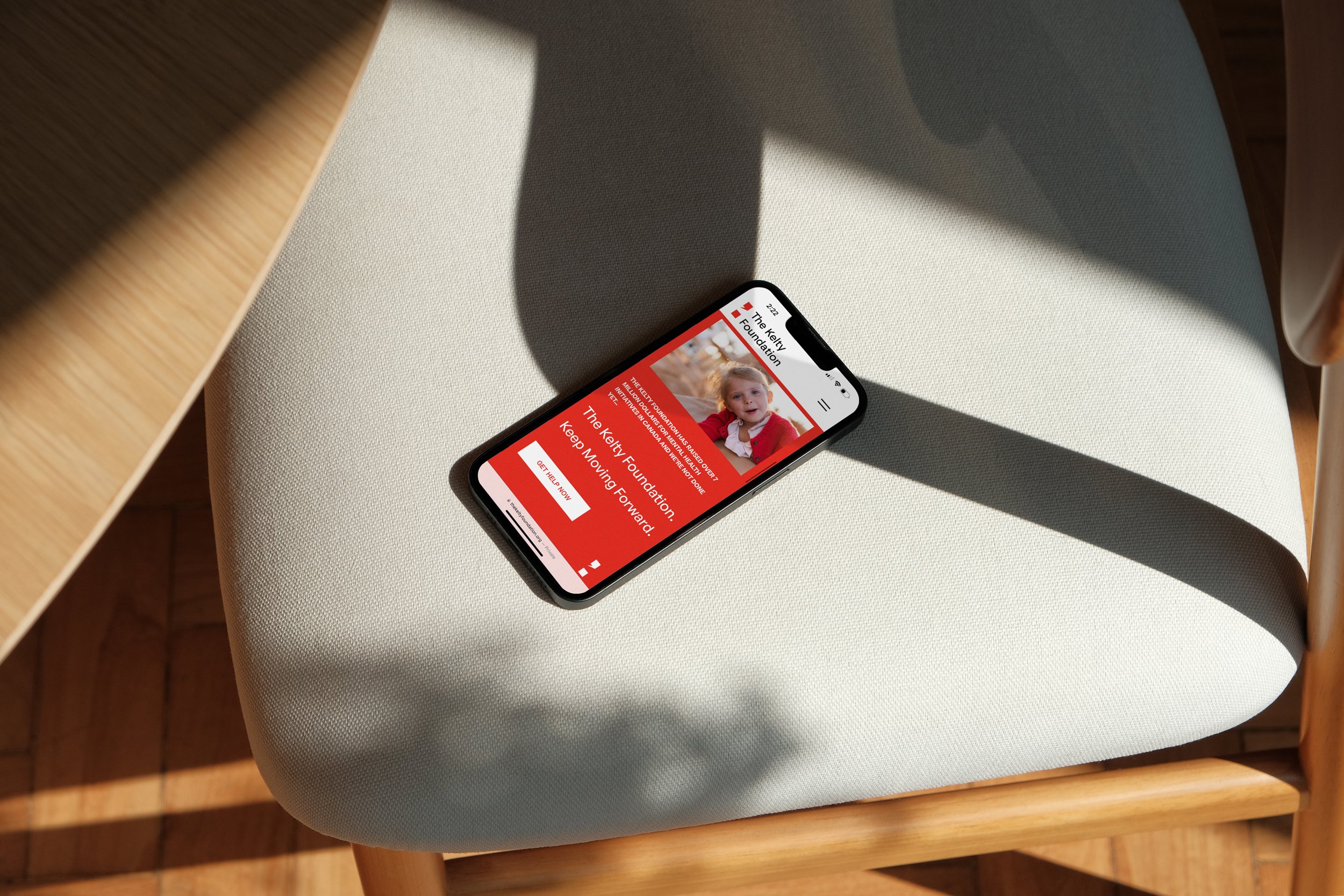
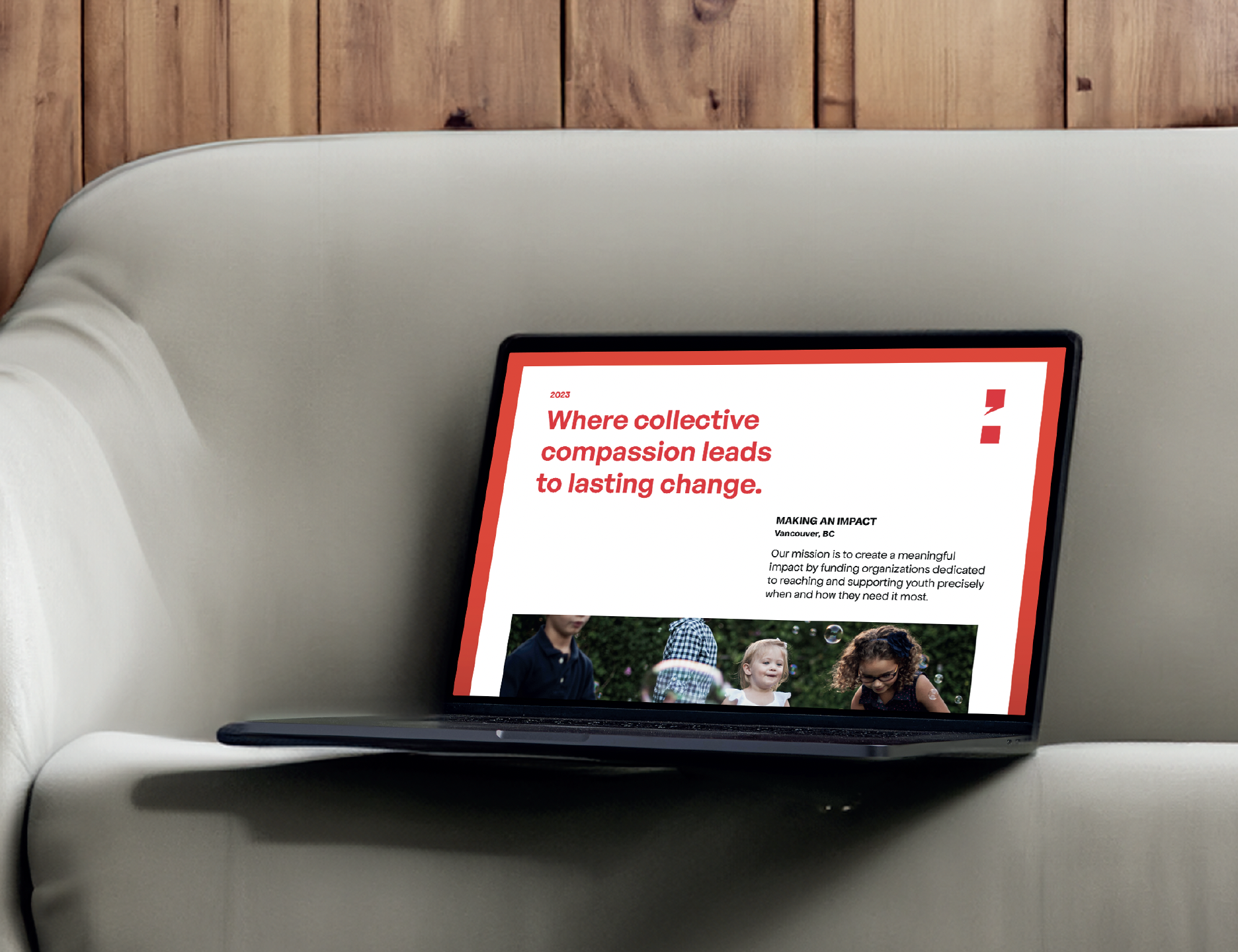
Utilizing a photographic style featuring colourful images of happy and engaged youth in the rebrand showcases the positive outcomes and well-being it strives to promote among young individuals dealing with mental health challenges. These images capture attention and resonate on an emotional level, enhancing storytelling and share ability on various platforms. They convey a sense of positivity and optimism, amplifying the organization's message and reach. In terms of design, the colourful imagery adds visual interest and energy, complementing the modern and fresh design direction.
Lead Designer at NatPark Creative Agency