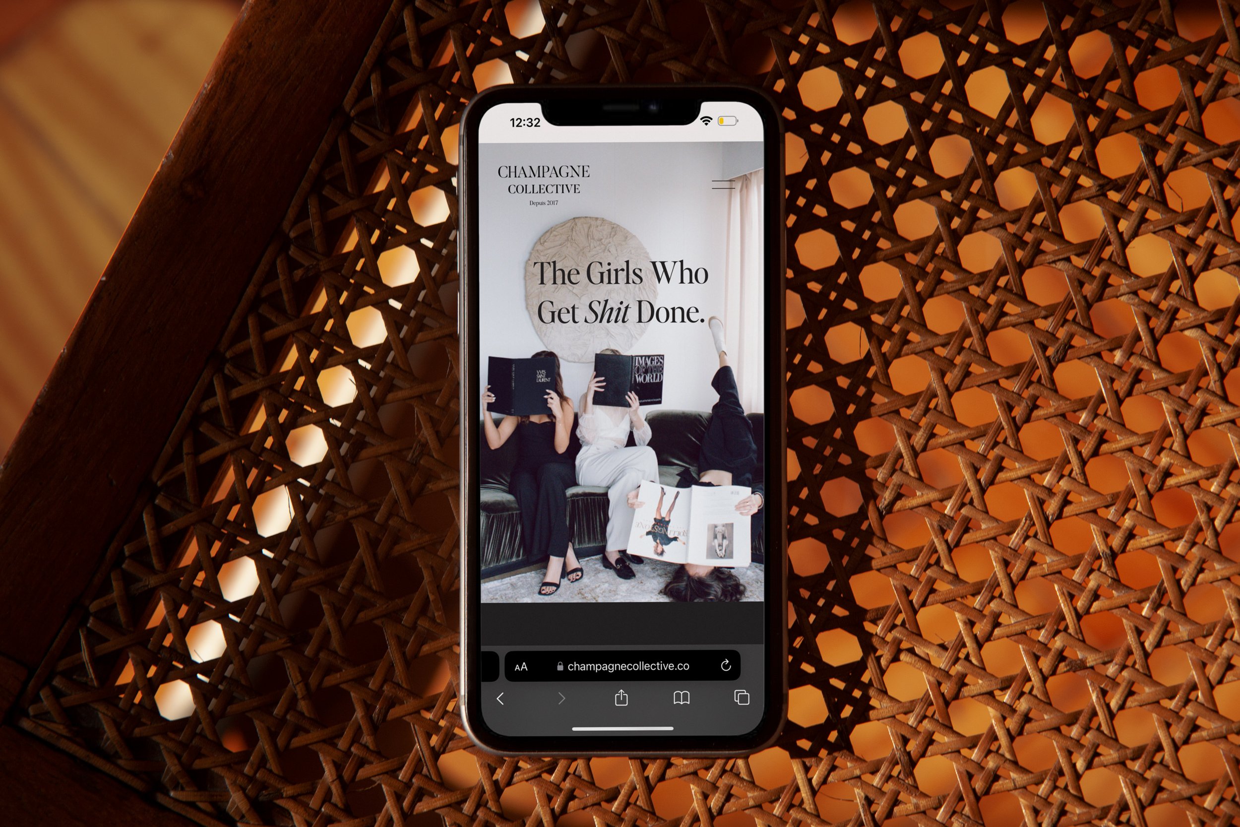
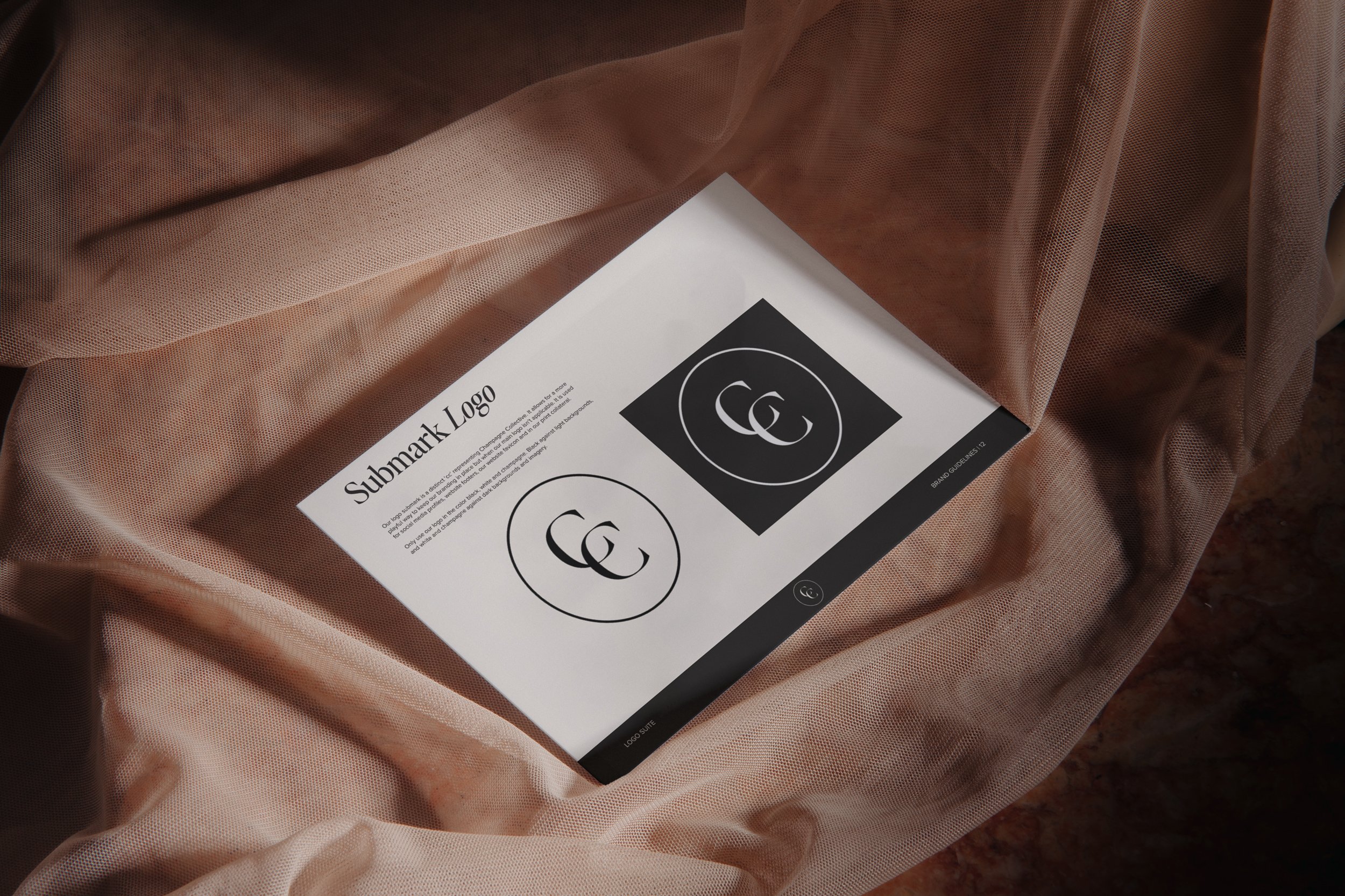
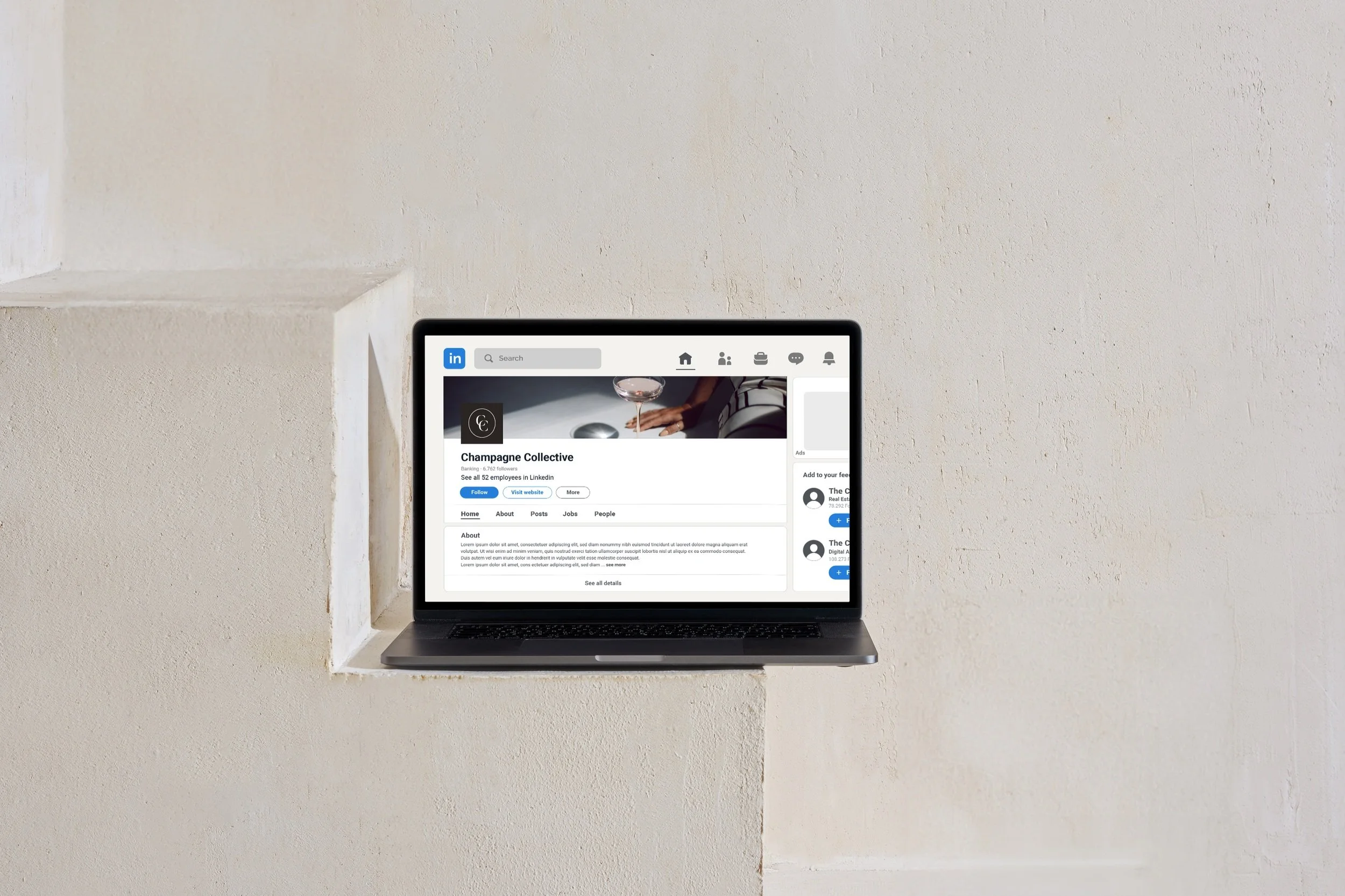
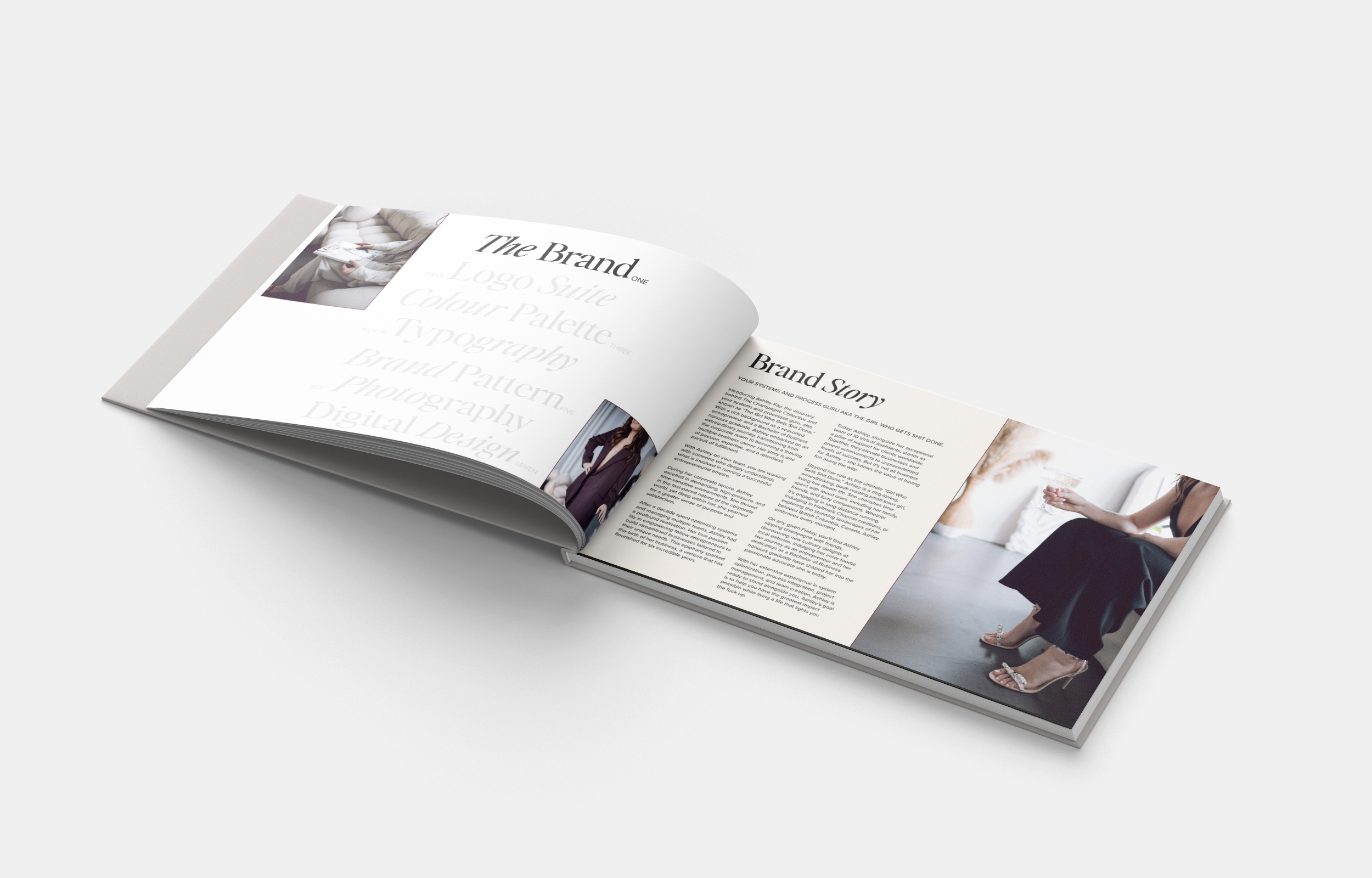
Champagne Collective’s rebrand is a testament to luxury and opulence. Embracing the existing tagline, “Girls that get shit done,” the rebrand showcases Champagne Collective’s bold and edgy personality. This brand resonates with ambitious women and serves as a testament to the brand’s commitment to empowerment while maintaining a bold feminine appeal.
To convey sophistication and opulence, the brand typography blends elegant, classic serifs with luxurious and timeless cursive fonts. This fusion of traditional and contemporary typographic elements adds an expensive and lavish touch, perfectly aligning with Champagne Collective’s creative direction.
The high-quality brand imagery takes centre stage, drawing inspiration from editorial design. By utilizing large-scale visuals, we emphasize the grandeur and luxurious nature of Champagne Collective’s offerings. The choice of imagery is strategic, aligning with the brand’s values and aspirations – dependability, efficiency, success, and community. The editorial influence in the photographic and layout style adds an element of storytelling to the brand. This approach not only enhances the visual appeal but also elevates the brand’s perception, positioning Champagne Collective as a leader in its industry.
This brand embraces a modern and bold approach while preserving the essence of the original brand. By leveraging elements of its familiar colour palette, the brand ensures a seamless transition that retains brand recognition.
This strategic balance between familiarity and enhancement has allowed Champagne Collective to build upon its existing success while positioning itself as more than just a virtual assistant business; it has become a symbol of ambition, success, and the pursuit of excellence.
Lead Designer at NatPark Creative Agency
