Main&Park
Coming Soon
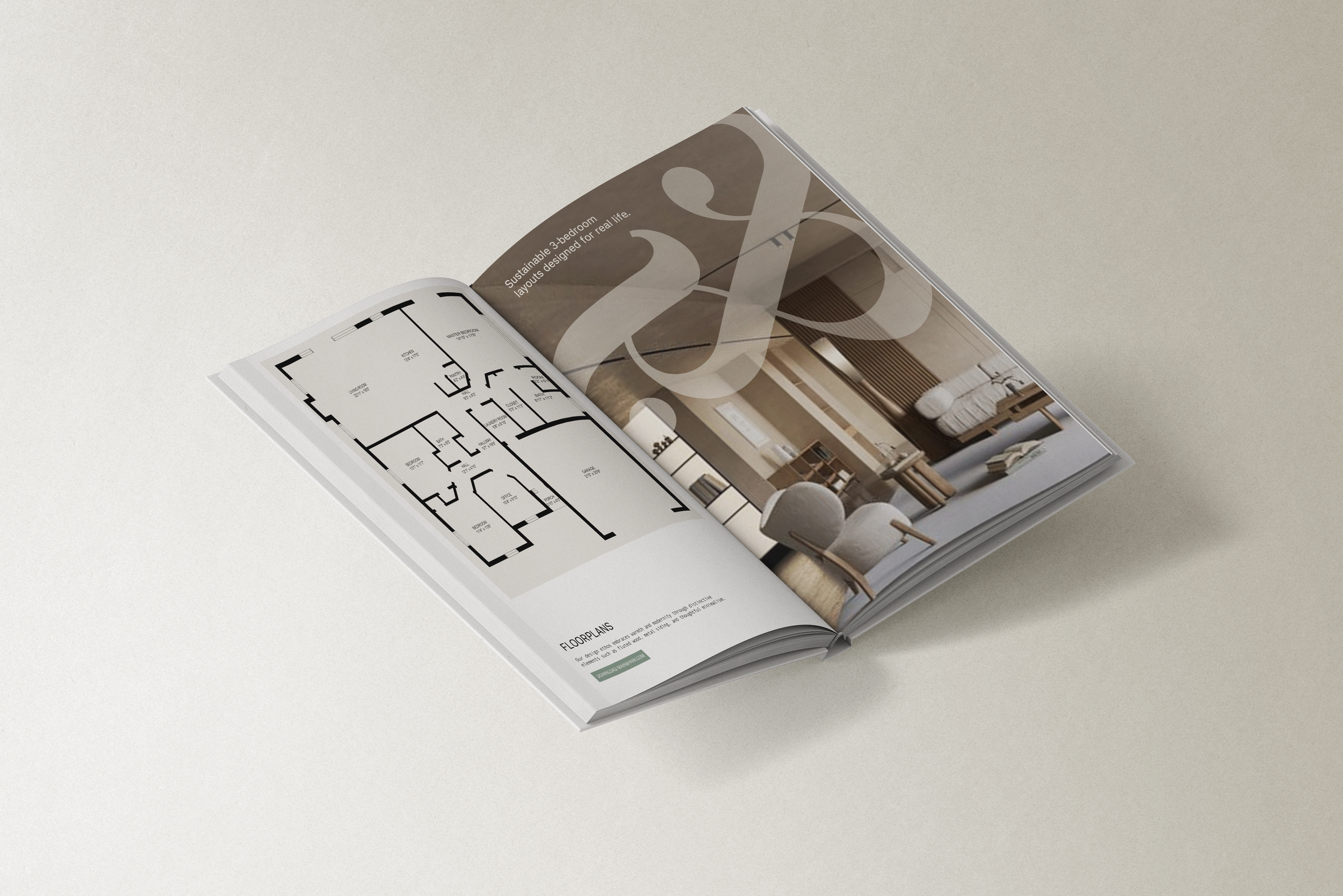
Main&Park embodies eco-conscious living through its certified net-zero townhomes and energy-efficient properties. Nestled between the vibrant shops of Main Street and the lush greenery of Queen Elizabeth Park, Main&Park ensures exceptional walkability and access to urban amenities. Collaborating with Deso Properties and Architrix, we aim to create a brand that intersects aesthetic value with functional design.
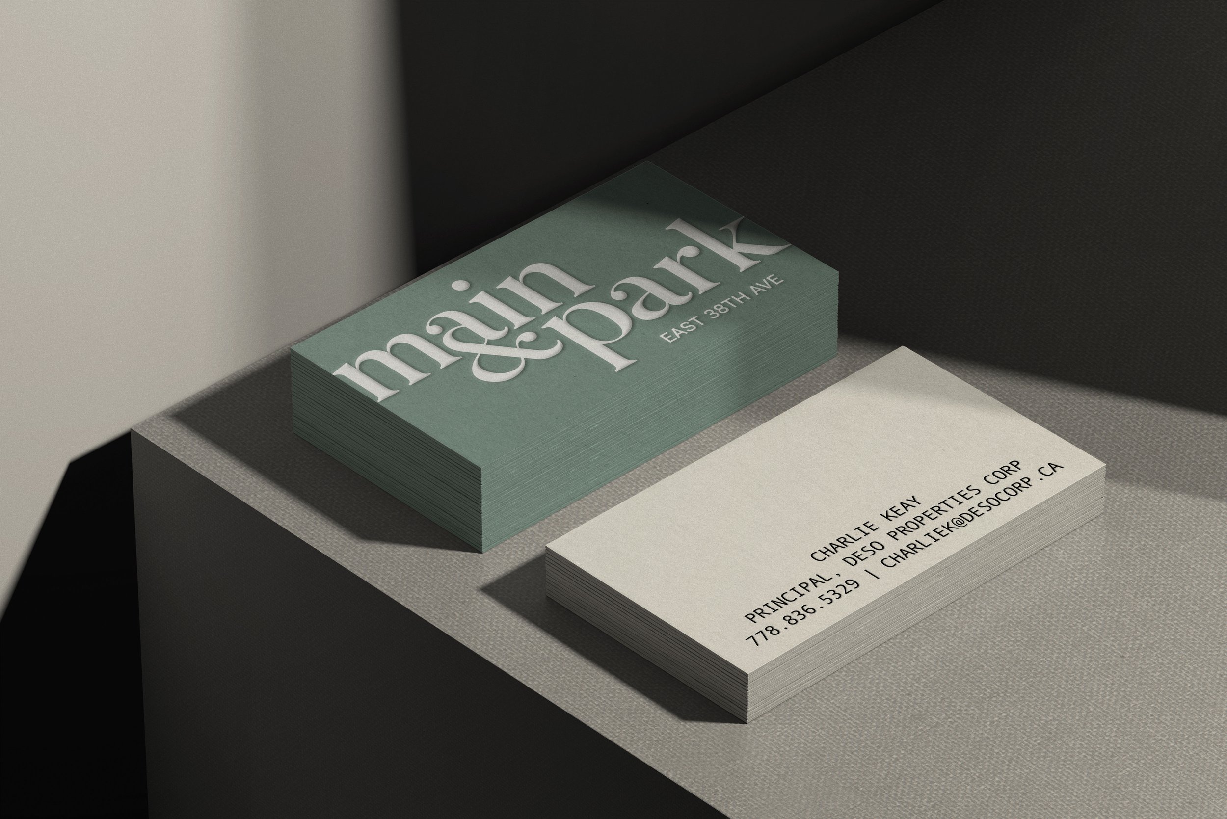
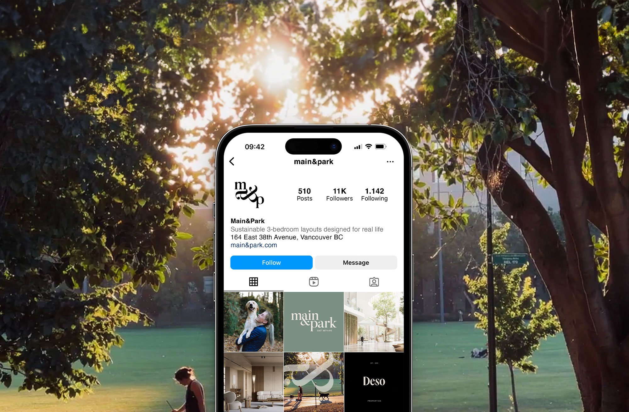
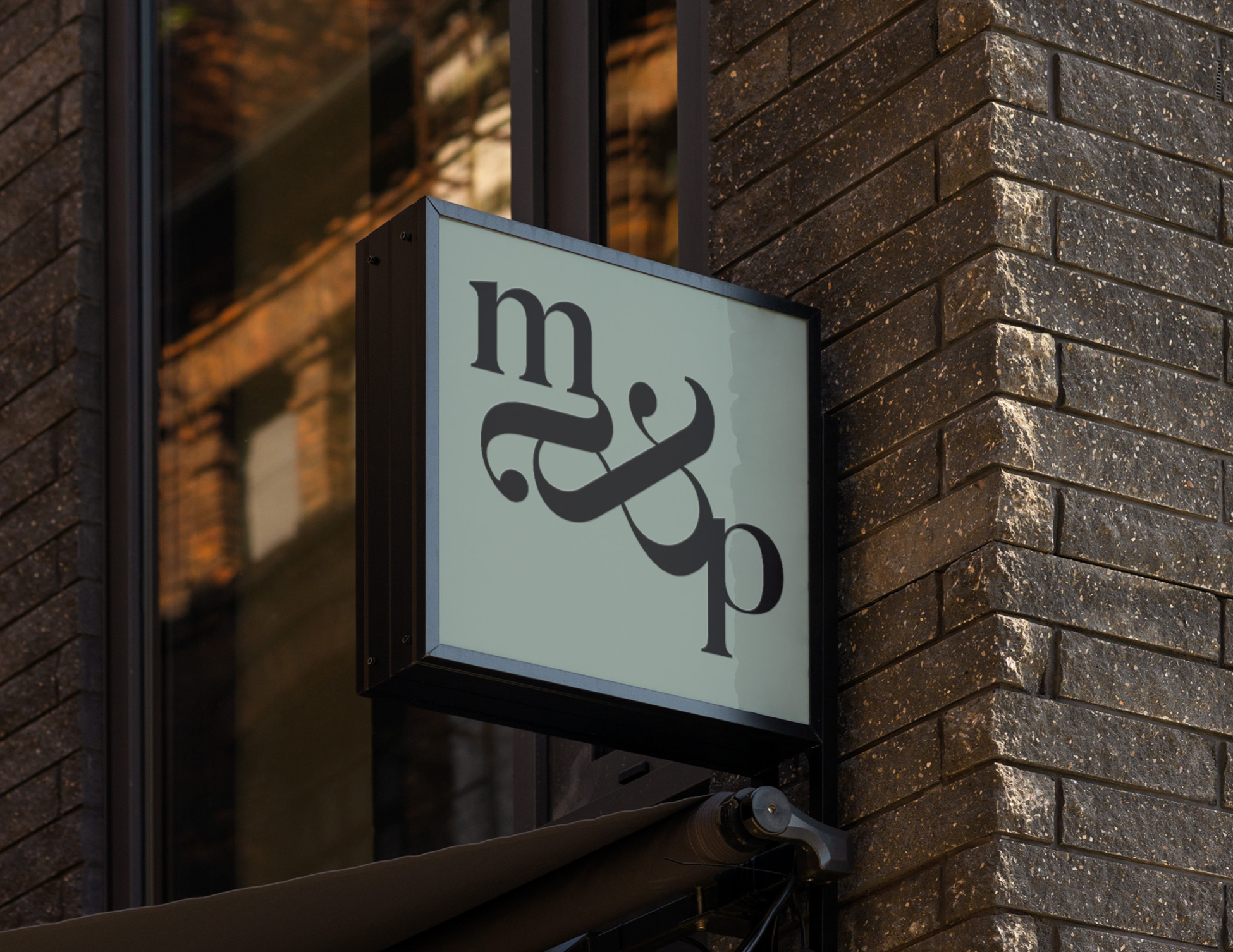
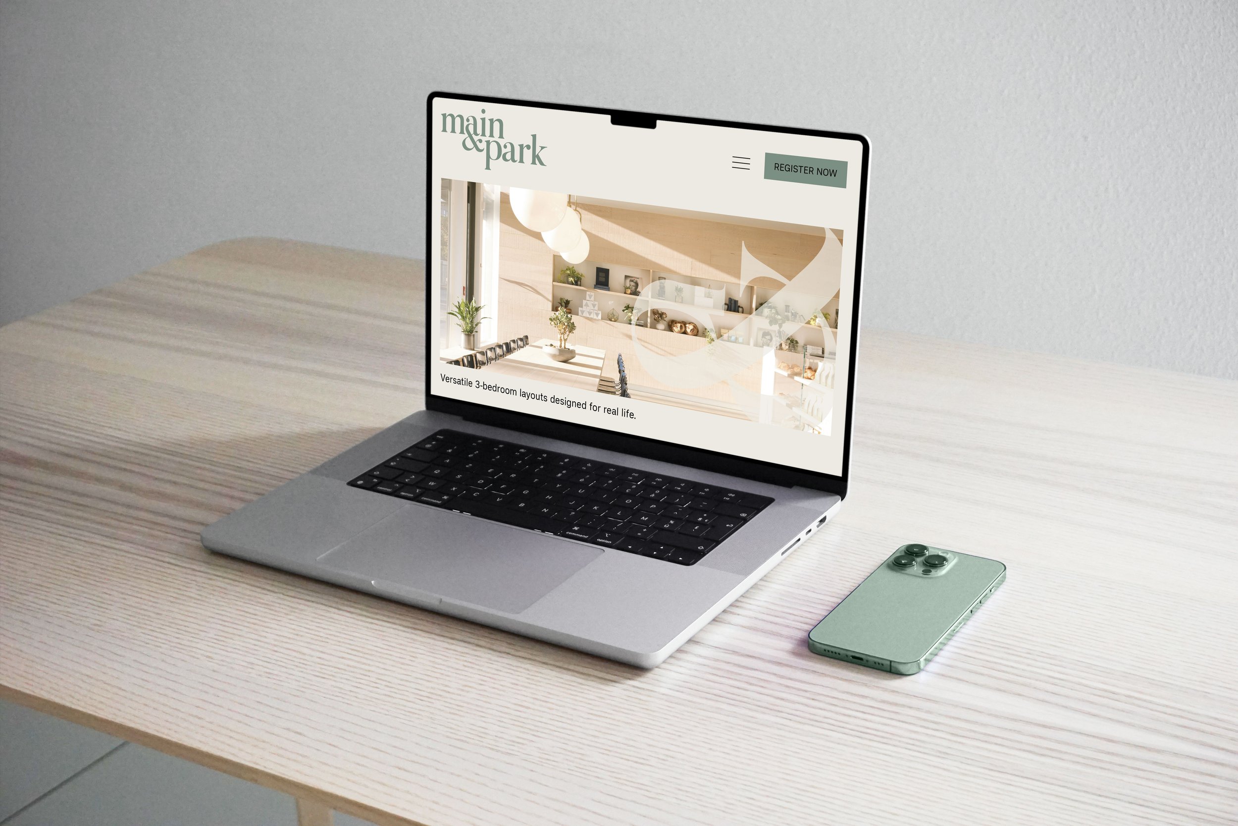
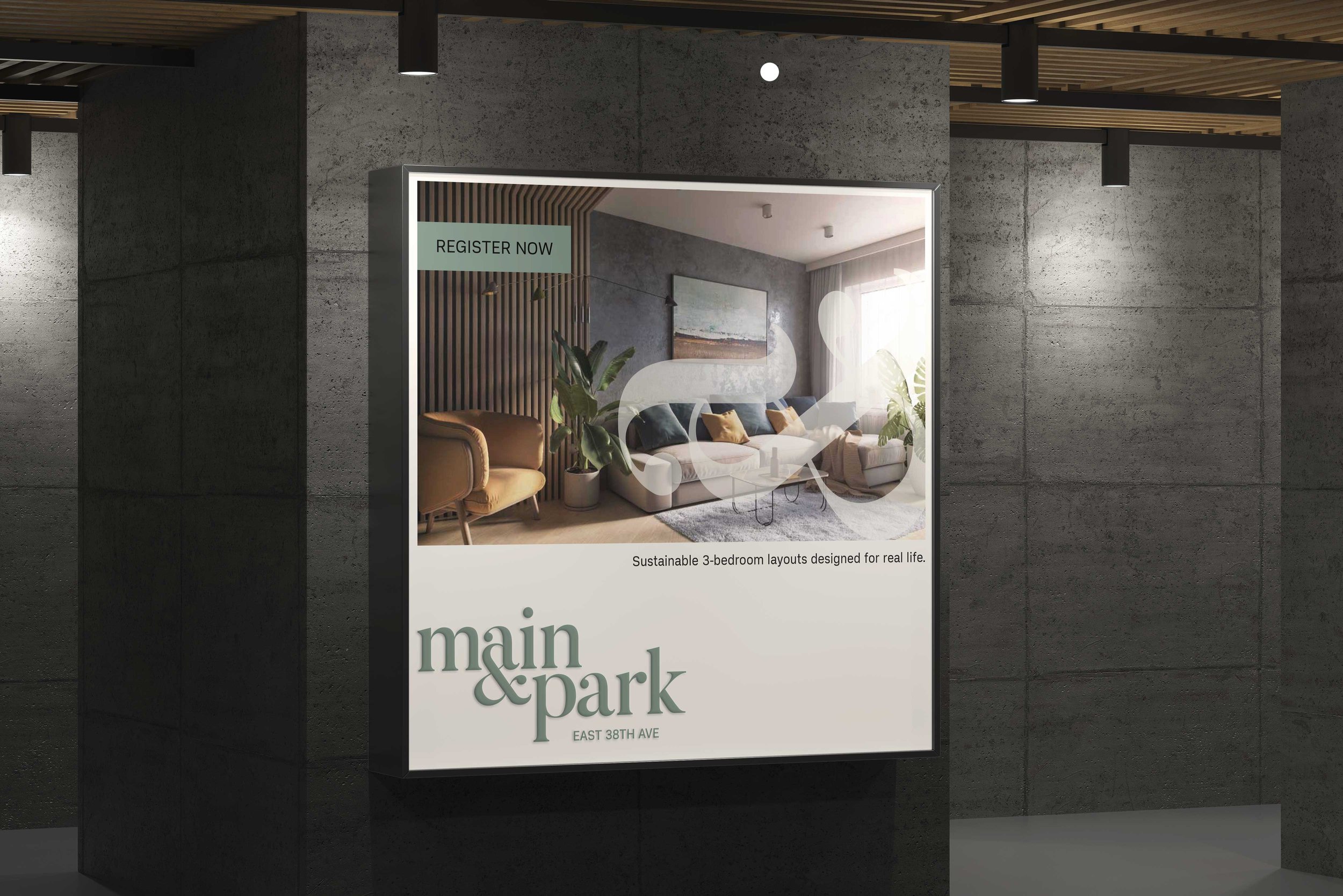
The visual identity captures the duality of urban and natural landscapes, symbolized by the ampersand in the logo and brand elements. The color palette of cool-toned sage greens, greys, and earthy tones mirrors the project’s ethos of sustainability and environmental stewardship, evoking a sense of tranquility and connection to nature. The use of serif typography conveys sophistication and attention to detail, appealing to urbanites seeking a refined lifestyle.
By integrating the ampersand with the letter “a” in “Main,” the logo visually symbolizes the connection between urban living and nature. This design choice enhances brand recognition while reinforcing the values of quality and trustworthiness.
Lead Designer at NatPark Creative Agency
